
Setup and Onboarding | IoT | Research | Prototyping | Usability Testing
Redesigning HP Printer Setup and Onboarding Experience
Overview
The Challenge
The current HP printer setup and onboarding flow within printer software, HP Smart, is lengthy, lacks a progress indicator, and does not provide specific guidance about features beyond basic printing. This has led to user pain points and a low net promoter score. Specifically, there are three main user pain points to address:
Setup complexity leads to user fatigue and friction.
Unfavorable timing for service offers.
Challenges in discovering the printer’s capabilities
The Solution
The strategy is aimed at streamlining and standardizing the setup process to enhance mobile app experience. This involves ensuring users have a functioning printer before presenting them with service offers and adding a user onboarding flow.
CONTEXT
Setup & Onboarding Design Team
May — July 2023
MY ROLE
Led Mobile UX Design, Wireframing, and Prototyping. Contributed in User Research and Visual Design.
TEAM
1 Project Manager
1 UX Strategy Lead
1 UX Designer
2 UX Writers
2 Visual Designers
2 UX Researchers
TOOLS
Figma, FigJam, Miro, Jira, Notion
Context
Printer development vs Software development
The development process for printers is inherently more complex than that of software. This complexity arises from the need to ensure seamless integration between physical hardware and printing software. Furthermore, the design process requires extensive testing and refinement, because the software interface design impacts hardware development. Changes to the hardware can be both time-consuming and costly.
How did we start this project and why?
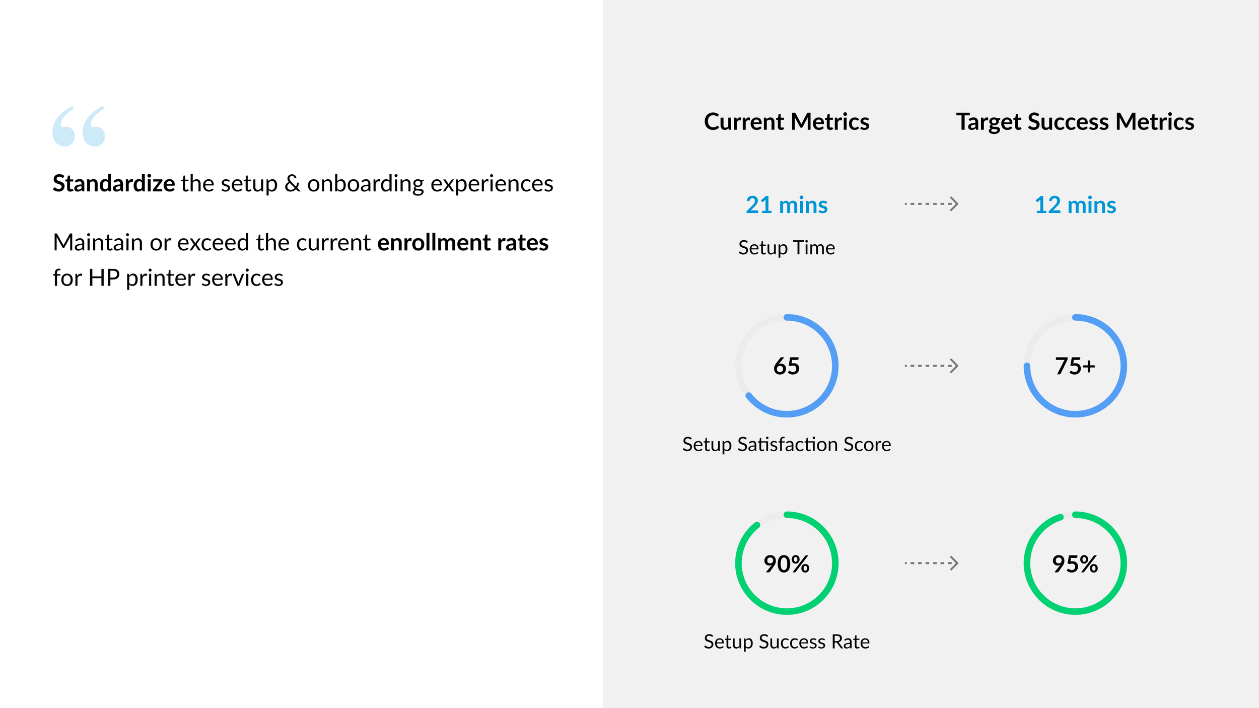
In HP Printing segment, one current metric really caught our eyes. Net Promoter Score is only 30, which is considered really low compared with other success metrics. Also, previous research indicates:
“Users are 2x less likely to enroll in our services if they encounter issues during setup. ”
To address this problem, cross-functional leaders hosted workshops in San Diego to rethink the setup and onboarding experience, and I was part of it. After the workshop, design team got a really important project, we’re going to create a north star version for printer setup and onboarding, to help us improve the business metrics and provide a better user experience.
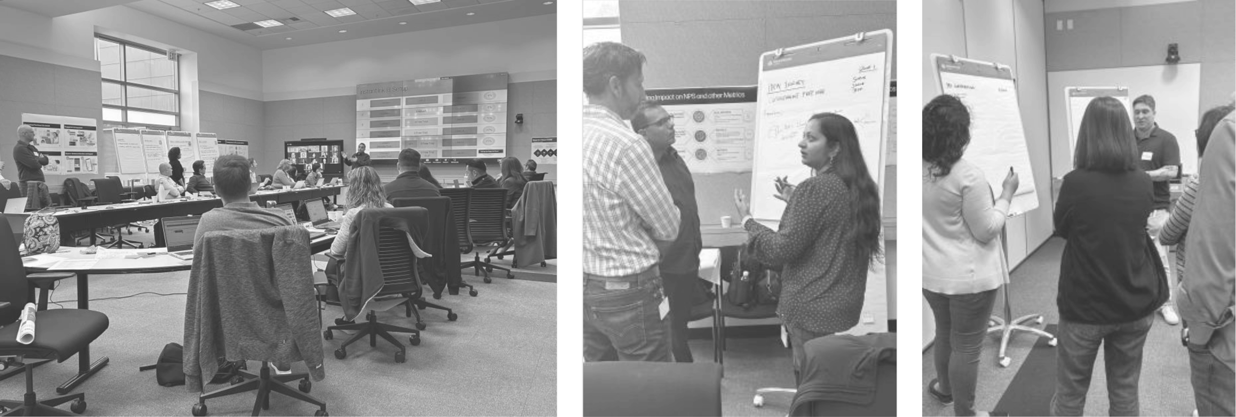
Setup & Onboarding Workshops in Sunny San Diego ☀️
Business requirement
Who are our users?
This project is targeting 3 primary user groups, who collectively represent 62% of our global base. Our target groups are pretty diverse about printing goals and printing behaviors.
Problems
However, we can only develop one solution for all user groups
So, we need to find out their common behavior patterns and main pain points. I created a user journey map to identify what are their common pain points. Luckily, I found out they were all very struggling during the second half of the setup.
Based on that, we can clearly define that we’ll focus on these common friction points for our north star experience. We want to improve user experience to help users get a more fluent setup process.
Prioritize 3 user pain points to solve
Considering the timeframe for this project being 2 months, we need to prioritize user problems to solve. After discussion with PM and design lead, we decided to focus on 3 user pain points.
Setup Complexity Leads to User Fatigue and Friction
Unfavorable Timing for Service Offers
Challenges in Discovering the Printer’s Capabilities
Address 3 user pain points through 2 design challenges

Design Challenge 1
Service offers during setup lead to confusion and drop-offs
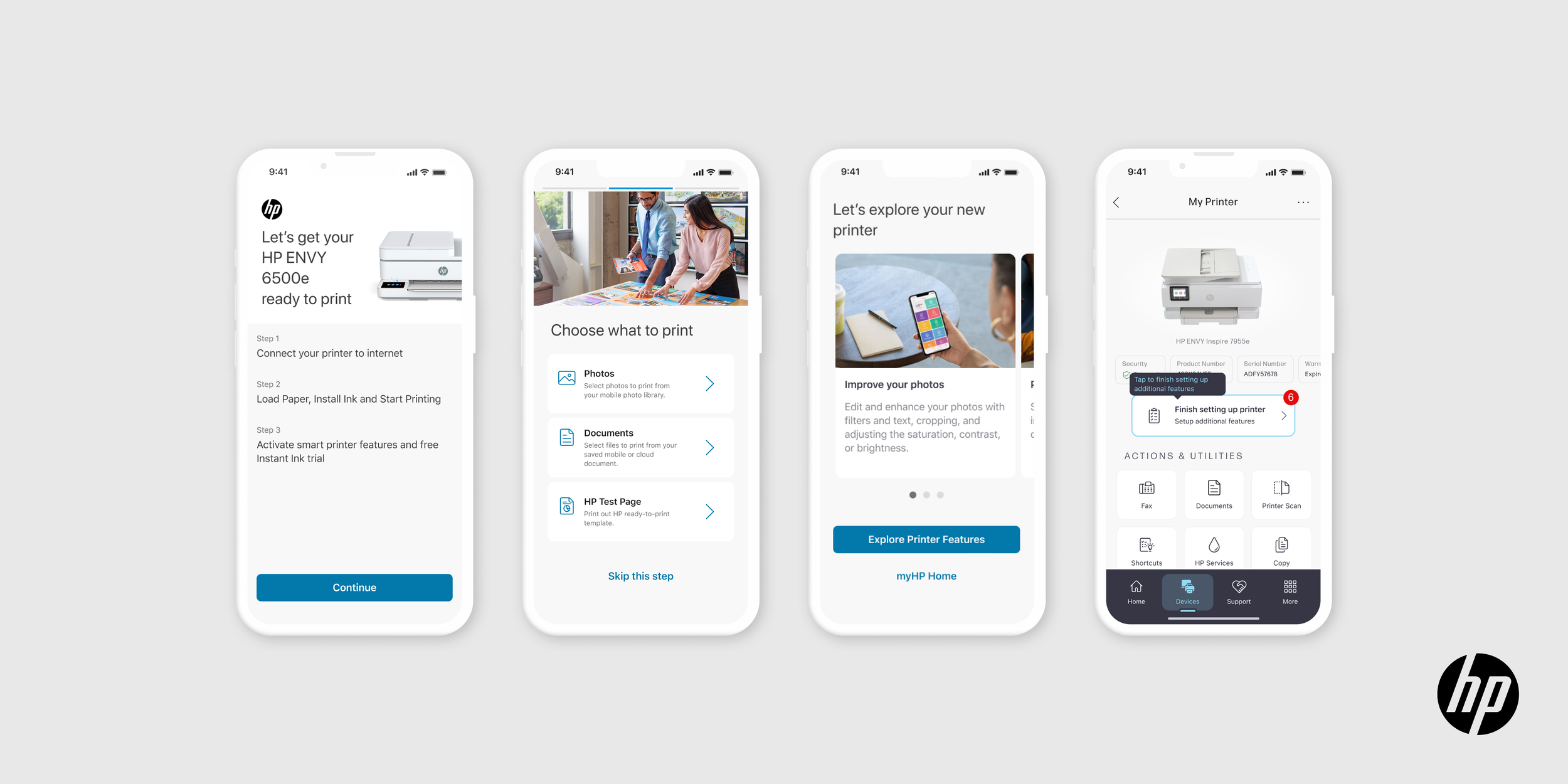
Looking at the current printer setup flow and screens, we can see that it contains too many steps. In addition, in the middle of printer setup, we ask users to create an HP account and sign up for ink delivery services. As a result, many users reported that there are too many choices to make and they feel overwhelmed.
IDEATING SOLUTION
Printer setup first, then service offers
To address this problem, I proposed a new user flow: we let users first go through the entire printer setup process, then present them with service offers that they can set up later. The goal is to make user flow more linear and easy to follow, while letting users have a functioning printer as quickly as possible.
How can users know where they are in the setup process?
After improving the user flow, I identified an issue with user interface. There is no progress indicator on current user interface. Therefore, users are unsure of where they are in the setup process or how many steps are left, which makes them feel confused and frustrated.
Separate setup process into three parts
To improve this experience, I separated the setup process into 3 parts, and introduced a setup overview screen at the start of each step. Step 1 begins with network setup, because it is the first friction point for all 3 target user groups.
IDEATING SCREEN
Design explorations | step overview
I did design explorations for step overview screen. I created 6 options. To get feedback, I presented during our weekly design review and did a quick concept testing with design team. We chose option D. Because it clearly lays out 3 steps in the setup flow, and it’s not text-heavy compared with other options.
Incorporate new UI pattern
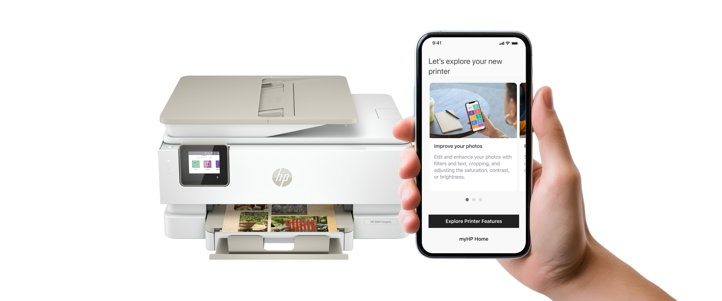
During the time I worked on this north star project, our cross-functional design team was creating a new HP app. That app will eventually replace the current HP printer software. For this project, I leveraged the color palette and design components defined by another design team to rebrand new screens.
How the new screens fit into setup flow
They serve as a checkpoint screen at the start of each step, indicating users where they are in the setup experience.
Design explorations | progress indicator
I also considered many details. One example is progress indicator. After an internal review, we decided to use option D. We analyzed the pros and cons of each design. For instance, option A has a problem when applying different languages, because some languages such as German, require more space. We chose option D because it looks clean and highlights the current step out of 3.
Design explorations | first print experience
We also bring our presentation to VP. After the discussion with the entire team, we aim to create a more personalized and flexible experience that allows users to test the printer according to their primary needs. Some users may prioritize photo printing while other may focus on document printing. So in the new design, we offer options to print a photo, document, or test page to try out the printer.
After I presented 4 options to 3 design leaders, we chose option D. Option A has accessibility and readability issues. Among the other 3, option D is most visually appealing and makes greater use of white space.
DESIGN VALIDATION
Compare north star version with current flow
I collaborated with research team to launch A/B testing for north star experience. 68 out of 100 participants preferred the north star experience over the current one, they found the new experience to be easier to understand, more informative, and faster than existing experience, and users appreciated being able to print quickly on the new experience.
Design Challenge 2
Currently, features and services suffer from poor discoverability
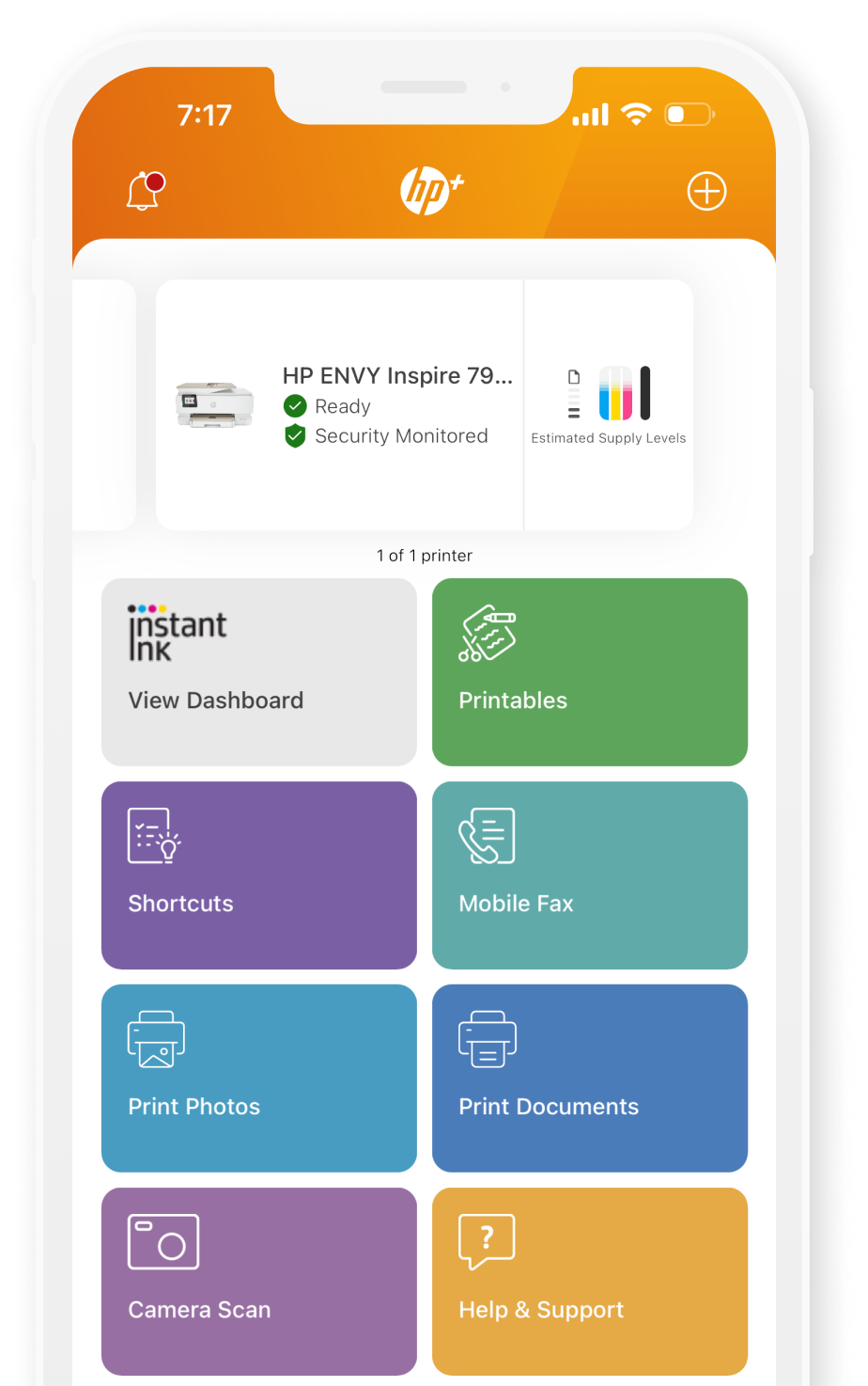
Here's the current experience: after the user finishes setting up the printer with the HP app, they land on the home page. If they tap on the printer card, they can see the current status of the printer along with other features. However, these features are quite hidden, which makes it difficult for users to find and use them.
IDEATING SOLUTION
Add a user onboarding flow
To address this issue, after discussing with PM, we decided to add a user onboarding flow right after service offers. This guides users to set up other features of the printer.
Why is user onboarding so important?
Our goal is to help users discover features beyond just printing, and allow them to set up these new features whenever they like.
THE IMPACT
What impact we have?

Usability Improvement
68% of participants reported the new setup experience is easier to follow and more intuitive than the current one

Scalability
Currently expanding new setup and onboarding experience to upcoming product launches

Cross-functional Alignment
Presented the final design to cross-functional design teams in HP Print segment, aligning future vision.
REFLECTION & LEARNING
What I’d do differently next time

Gather Qualitative Data
I would have tried harder to gather qualitative data from previous studies, as opposed to relying primarily on strategy vision documents.

Create Personalized User Onboarding
I aim to have a set of questions for users to quickly answer about their goals with using the printer. Based on their answers, we could suggest additional features for setup.
Lessons learned
Break down a large experience into smaller chunks for design
Balancing business goals with user needs