

Product Design
Baidu GRAVITY
During the summer of 2021, I worked as a Product Design Intern at Baidu International Technology in Shenzhen, China. I was a part of the International Product R&D Center UED team and mostly worked on improving the user experience of Simeji, the NO.1 popular keyboard app in Japan, and Gravity, an anonymous social networking app. My responsibility was to design new features for shipping new versions of these two mobile apps with fellow designers, PMs, and engineers.
CONTEXT
International Product Center @ Baidu International Technology
May — Aug 2021
TEAM
1 design lead
2 interaction designers
2 visual designers
1 product manager
engineering team
MY ROLE
Design research
Concept development
UX/UI Design
Design system
Prototyping
TOOLS
Sketch, Figma, Photoshop, Miro
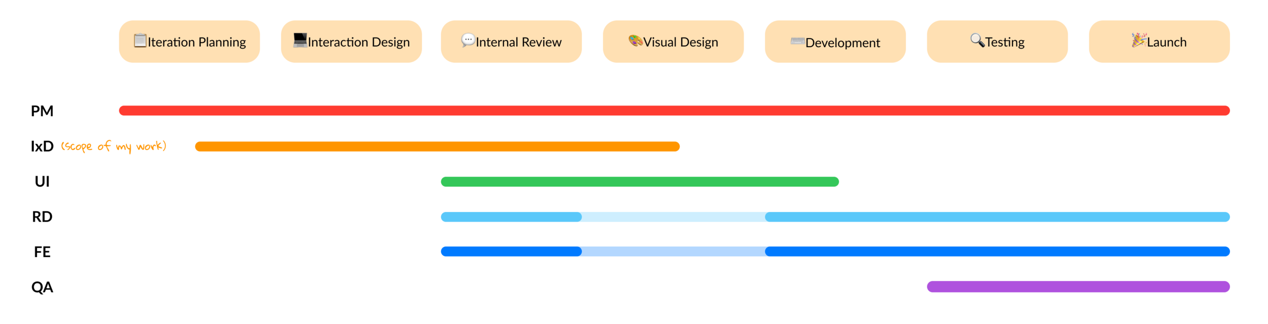
How do I collaborate with cross-functional team?
PROJECT 1 - GRAVITY
Background
Gravity is an anonymous social networking app that targets users in Japan. First launched in Dec 2020 as a free app, the project team now wants to offer premium plans that allow users to unlock more features.

what was the problem we were trying to solve?
―
How might we motivate users to subscribe to a premium plan?
what were my responsibilities?
―
Conducted competitive analysis on premium plans (features, prices, etc.) in other similar social networking apps.
Prototyped low- and high-fidelity designs on subscription user flow, wireframes, and UI graphics
Participated in QA sessions with project managers and engineers to fine-tune the final user experience
Research
What motivates users to make the decision to subscribe to the service?

I researched the leading dating apps to study when to trigger a subscription screen and how to present advanced features.

Core project — Gravity Subscription UX
I collaborated with a UI designer to build a design system for GRAVITY premium plan by leveraging the existing design systems and creating new visual components. I created mini flows and interactive prototypes to show how we would incorporate premium plan subscription screens in the current user flow.
Drawing sketches
I started visualizing the subscription screen and user flow with sketches. I created three different layouts for subscription screen based on learnings from researching subscription UX.
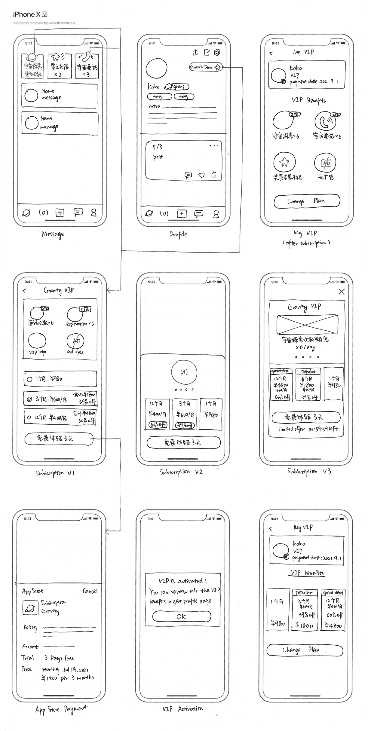
Making it digital
Taking it a step further, I created low-fidelity wireframes in Figma. Some of the key wireframe screens are highlighted below.

Connecting the frames
The premium plan subscription page can be triggered when the user tries to:
Unlock more times of Space Call per day
Unlock more times of Space Exploration per day
Tap “Gravity Star” on their profile page

Testing it with users
I walked through the wireframes with 5 fellow designers and PMs. The goals of this wireframe user testing are:
1. Test the user flow and identify any confusion.
2. Gain feedback on the subscription screen designs.

While keeping these findings in mind, I started the next round of prototyping: visual design and high-fidelity prototyping.
Visual Design
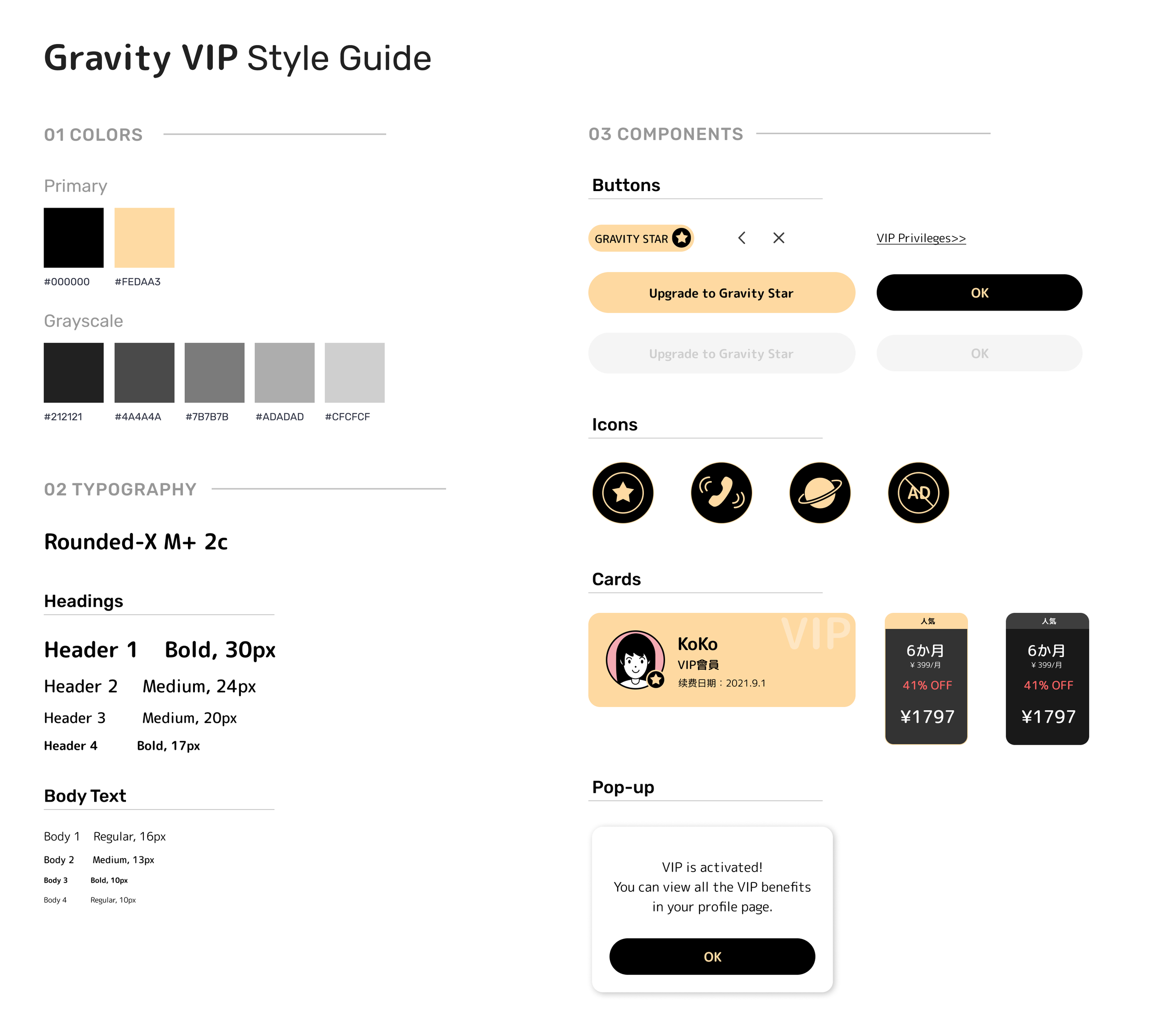

Subscription Screen Design

Interaction Design
Challenges & Takeaways
01 / Embracing the Uncertainty
Throughout my time with Baidu, I was constantly faced with ambiguity and was expected to rescope my project based on my team's needs. Even towards the end of summer, my team had a week of an intense design sprint to refocus and align the project with leadership's feedback. Because there were so many moving parts, I had to adapt to changes quickly, learn to be comfortable with not knowing, and to keep an open mind while setting realistic expectations and priorities to push my project forward.
02 / The perfect solution doesn’t exist
I found myself getting stuck in the details constantly at the beginning, trying to find a solution that’s “perfect”. I remembered spending a day iterating a draft because I was trying to satisfy all the edge cases. It was the moment when I truly understood the importance of “always remember what problems you are trying to solve”. Doing so helped me decide what advice to take and not get lost in those heated discussions and the clashing views. I realized how it works in the industry that tends not to be creating a 10/10 solution, but one that optimizes and solves the core problem well. There is always more than one way to solve a problem, sometimes it is more crucial to make the decisions fast. A more solid strategy is to have the MVP out to the market, look at the stats and the user feedback, then decide what other problems to focus on next.
03 / Collaborating with the PMs and engineers
Interestingly, the engineers and the PMs here all have some basic visual design knowledge, and a lot of the designers know how to code as well. I was lucky to be in a team where PMs, designers, and engineers all have a voice in the product decisions. During the summer, I participated in weekly sync-up meetings, smaller group feedback sessions and 1-1's with my mentor to receive and give feedback. As much as I valued getting feedback, everyone on the team was eager to hear my opinions and I tried to provide thoughtful feedback and think about what direction I can push the team towards. I also learned to understand and empathize with different positions from teammates. A product manager might advocate for designs that align more closely with the product roadmap while an engineer might prefer designs that can be implemented effectively. Understanding different internal goals and trying to bridge the gap was a fun challenge.

Images taken in Baidu