

Information Visualization
Mapping Wildfires in California
Since arriving in California, I have noted that the annual wildfires in California have increased in frequency and impact. Visualizing the impacts and risks of wildfires helps raise public awareness of weather-related problems, and facilitates pressure on the government to take more effective measures to deal with disasters. This project gives viewers the opportunity to learn more about wildfires in California and explore the data more easily.
CONTEXT
Side Project
Oct — Nov 2019 (4 weeks)
INDIVIDUAL WORK
Research
Ideation
Prototyping
Usability Testing
TOOLS
Excel, Tableau, Illustrator, Photoshop
Context
“A small shift in one thing can produce big changes in everything.”

Project Overview
How might we help raise public awareness of the risks of wildfires in California and their impacts?
In this project, I created four interactive information visualizations regarding California wildfires' affected areas and statistics.
Uses of this interactive tool

Motivation
I was completely awake after seeing a mandatory evacuation alert email from Los Angeles Fire Department at 7 am on October 28, 2019. Luckily, I do not live in an area that requires immediate evacuation. However, my supervisor and two colleagues could not come to the office because the southbound 405 freeway was closed due to the Getty fire. It is my fifth year in Los Angeles, and California fires are getting worse.

seeing smoke from Getty Fire on my way to office on October 28, 2019
Initial Research
Wildfire and Climate Change
In federally managed forests in the western U.S. today, wildfires larger than 1,000 acres have become nearly 5 times more frequent and burned areas 10 times as large as in the 1970s.
For much of the U.S. West, projections show that an average annual 1 degree Celsius temperature increase would increase the median burned area per year as much as 600 percent in some types of forests.


How does climate change affect wildfires?

There are many forests and valleys in the western United States. The humid and cold climate in winter and spring provides excellent conditions for plant growth. Therefore, when summer and autumn come, the climate becomes hotter and drier, and the fuel available for wildfires continues to accumulate. As a result, there is a significantly increasing trend in the number of large fires and the total area burned.
Wildfires in California
In December 2017, the Thomas Fire became the largest wildfire ever recorded in California. However, this record was refreshed again in 2018. The Mendocino Complex Fire broke out on July 27 in Northern California and grew to be the largest fire in state history, with 459,123 acres burned.
The Camp Fire was the deadliest and most destructive wildfire in California history, which left 86 dead in Paradise, and caused more than $16.5 billion in losses.

firefighters battle flames in Paradise
Paradise lost 90% of its population after Camp Fire
The Challenge
In researching the history of wildfires in California, I found some issues:

How might we help to raise public awareness of the risks of wildfires in California and their impacts?
Idea
Create an interactive tool that would present affected areas of California wildfires in a more intuitive way and allow viewers to explore the data more easily.

Data Preparation

The California wildfires dataset I found was a large dataset, containing roughly 20,000 records with information on over 20 attributes. During the data cleaning process, I filtered out irrelevant data, such as fire-fighting method, fire identification numbers, and command agencies.
Design Process
Ideation
Following the research, I began exploring different types of graphs and charts.

Paper Prototype
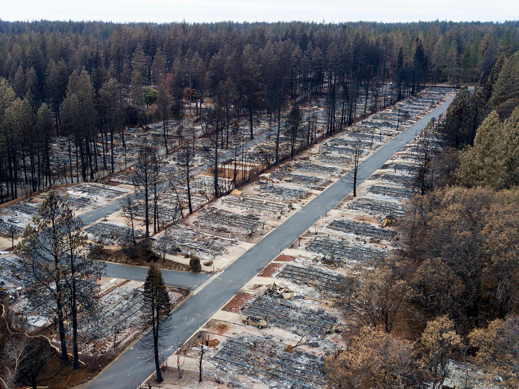
Through down-selection, I narrowed down the concepts and created two paper prototypes for testing. My goal was to find the most effective combination and arrangement of charts to communicate the relevant information effectively.
The initial paper prototypes include four different kinds of visualizations:
a map of wildfire perimeters for individual years
a chart showing the distribution of wildfire alarm dates throughout the year
a chart showing acres burned by California wildfires per year
a dashboard with the top 20 largest California wildfire locations and acres burned by each fire.

prototype 1

prototype 2
Usability Testing Findings
By testing with friends, I learned that:
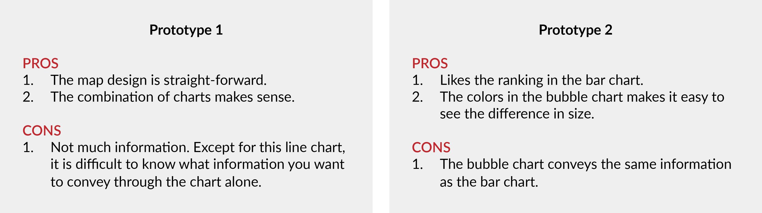
Some takeaways for the next step:
Categorize the charts by colors helps to show differentiation with size.
Explore the way to add interactions between two charts.
Pay attention to details such as title, subtitle, axis configuration, and field labels.
Mid-fidelity Tableau Prototype
I incorporated the map and line chart into the mid-fidelity prototype. These two visualizations provided users with more information, including variations in acres burned per year with the gradient color scheme.

prototype 1: view in Tableau Public

prototype 2: view in Tableau Public
Usability Testing Findings
I conducted in-person usability testing to evaluate my second prototype. I gave 4 participants (2 male and 2 female) a contextual scenario and asked them to think aloud while exploring the mid-fidelity prototype.
Usability issues I found and fixed:
Refine titles, headers, and labels.
Refine the type of graph to make it easy to understand.
Participant 2: “Prototype 1 looks fancy, but the information conveyed in the line chart is not straightforward.”
Create interaction between charts on the same dashboard.
Participant 4: “I like the interactions in prototype 2. Maybe add the same feature for the other prototype.”
Final Design
What are major wildfires in California?
When hovering over a dot on the map, the tooltip will show the name and acres burned of the wildfire, providing richer information to the viewers. Meanwhile, the corresponding data in the bar chart will be highlighted. When you hover over a wildfire name in the bar chart, the dot representing that area on the map will be highlighted.
Where did California wildfires occur?
I plotted the perimeters of more than 100 years of California wildfires on the map. Users can use the drop-down menu to select a particular year to see wildfire perimeters. When hovering over a dot in the left chart, a tooltip will show the year, number of wildfires, and acres burned. Meanwhile, the corresponding wildfire locations in that year will be highlighted on the map.
When did wildfires occur?
By hovering over stacked bars, we can compare the number of wildfires that occurred in the same month over the years. I applied the same color for every two months to make the visualization fewer colors and more readable. When hovering over each segment of the stacked bar, the tooltip will show the month of alarm date, year, and number of wildfires in that month. All the listings within the same month will be highlighted, and the corresponding data will be emphasized in the legend.
How are California wildfires related to climate?
Since arriving in California, I have noted that Los Angeles has been getting more rain in winter and early spring after the 5-year drought ended in March 2017. This experience inspired me to explore the potential link between climate and wildfire.
To begin with, I studied the correlations between acres burned by wildfires and summer precipitation & temperature.
I used the climate data in the 10-year span of 2009 to 2018 from US Climate Data.
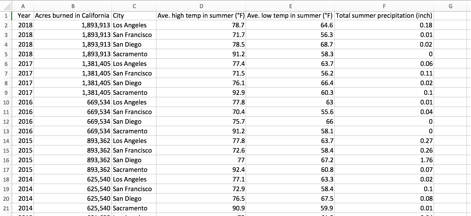
I used the combination of bar chart and line chart to validate. By selecting each major city in California, we can compare the link between wildfire activity and climate conditions of different areas in California. We can see an ascending value of total acres burned over the years. Meanwhile, the correlations are relatively clear: dry summers are strongly correlated with an increase in how many acres are burned by wildfires.
Learnings & Reflections
My next steps are to improve this project in terms of process and engagement. I found myself restricted by Tableau’s limited functionality, and had to dismiss many initial ideas. The current dataset is static in Tableau. I am interested in finding ways to make my visualization live. How can we help California residents know if their homes are in a fire hazard zone? How can we help them see how far the nearest wildfire is from them? In the next version, I would like to continue exploring other information visualization platforms, such as developing a website that would enable users to enter a zip code, see the home location on the wildfire map, see the wildfire hazard zone in which it falls, and access fire evacuation guidelines.
This project also encourages me to think about accessibility and inclusivity. How can we take care of information access for the visually impaired group? Obviously, information visualization poses a huge challenge for screen readers. If we can write alternative text descriptions of images, we can provide them with data sonification. In making any information visualization, we should consider not only how to make most users understand quickly, but also how to ensure that every user has the opportunity to get the basic understanding.